End of Semester One

(thought it would help if this is at the top of the blog)

My aim was to create elements and learn skills for developing a part of a game Take Two.

What is Take Two?

A sci-fi genred sandbox toon/celshaded styled design game. Help create and design a second earth to help humanity and new life forms survive.

Plot:

It’s in the far future where technology and medicine has evolved. Humans have learnt how to use more of their brain capabilities, and how to use AI in a more simple way than just mobiles, but directly planted into their brain so they can access things like wiki in just a quick thought. This of course created better medication leading to longer life spans. This had a bad effect on earth as it was getting too over populated so humans developed an AI capable of building a new planet habitable for humans and other life forms.

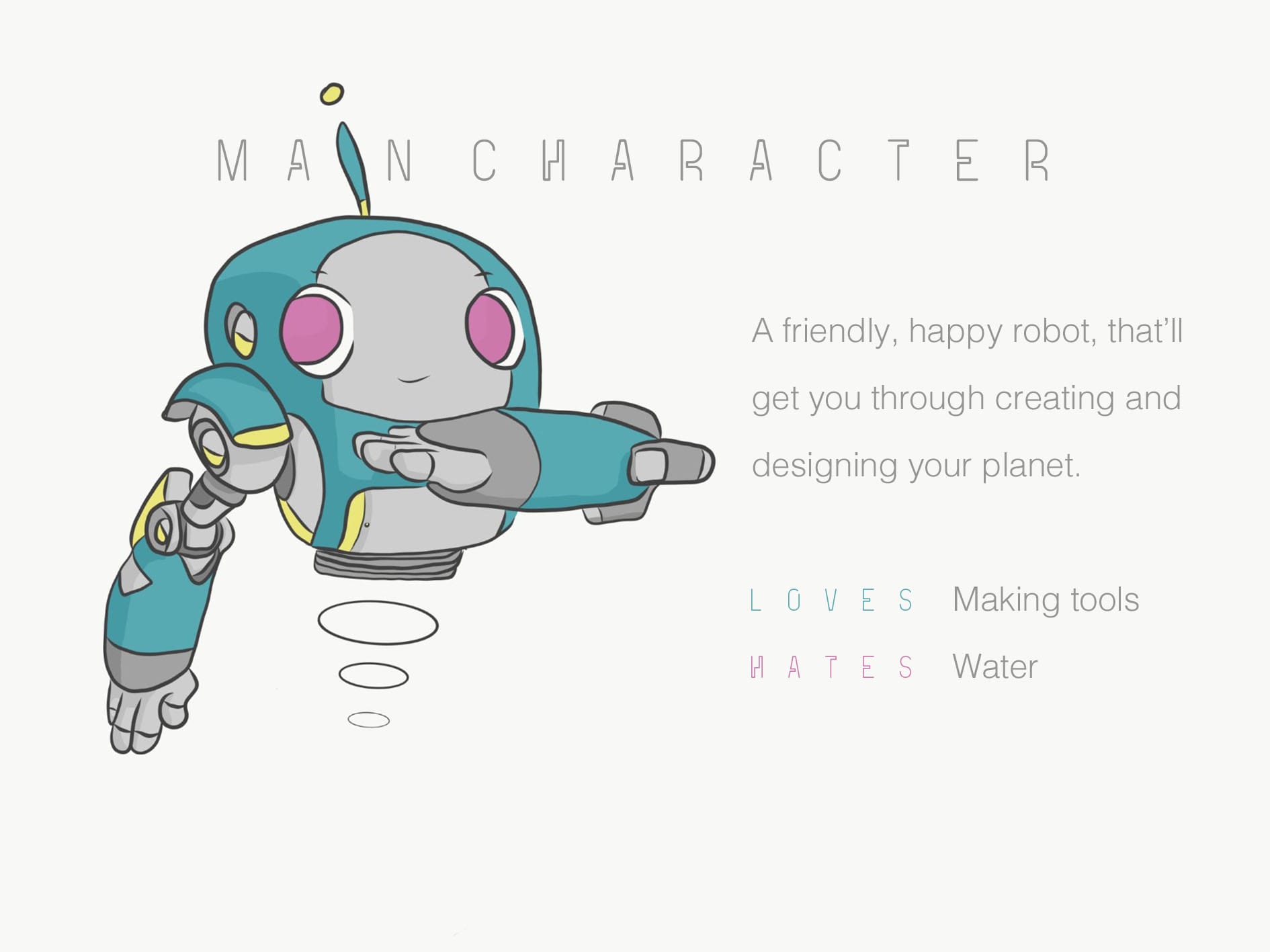
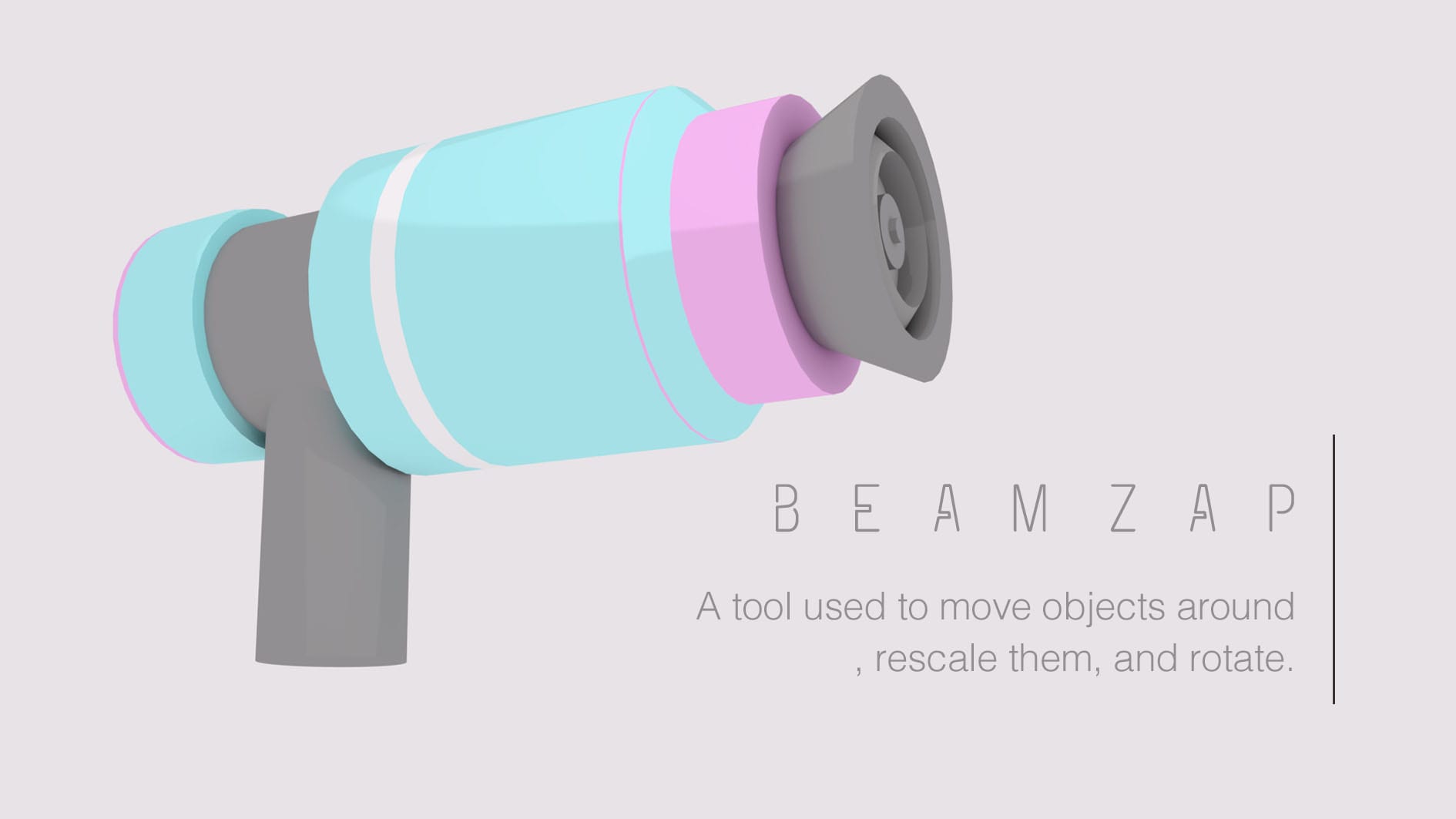
I’ve designed the main character (has no name as the player gets to name it), the user also controls it and plays the game through it. A very jolly robot who takes pleasure in collecting resources and building new land and tools. However, towards the end the robot gets run down and socially aware and paranoid that it’s just a part of an experiment and only just being used. (The more the player builds with it and creates new tools (mini AIs) , (friends for the robot), and the more life forms the player successfully manages to make live on this new planet the happier the robot remains.

Target Audience:

Originally targetted at young adults, specifically creative young adults aged 19-25, any class, most people have access to a PC. However, as I looked into some research, the style i’m going for is best suited for a younger audience (since they love minecraft so much).

The style is basic and would suit people aged 10 – 17. However, the story would be very in depth, younger people may not get into it as much but still enjoy the designing/creating aspects of the game. In addition, as technology and graphics develop the younger audience are getting more used to games with demanding/detailed realistic graphics. They might not like the toon style if it’s simplified anymore. The style is similar to Gary’s Mod, and Borderlands, which may interest a slightly audience more for the nostalgia. On the other hand, pixel games have made a huge come back and children are showing interest (i’ll stick the evidence and research behind this on my critical evaluation).

Therefore, my target audience is creative students from late secondary school, onwards till mid 20s. It is for all genres and classes. Initially due to the genre and the game mechanics it was going to be targetted at males however, there’s been a huge rise in other genders playing games and showing interest in gaming. Therefore, i’ve just used a wide range of colours that suit them all.

Final Outcome towards Take Two?

Everything still seems in apha phase however, I’ve grown confident in my skills developing content for the game.

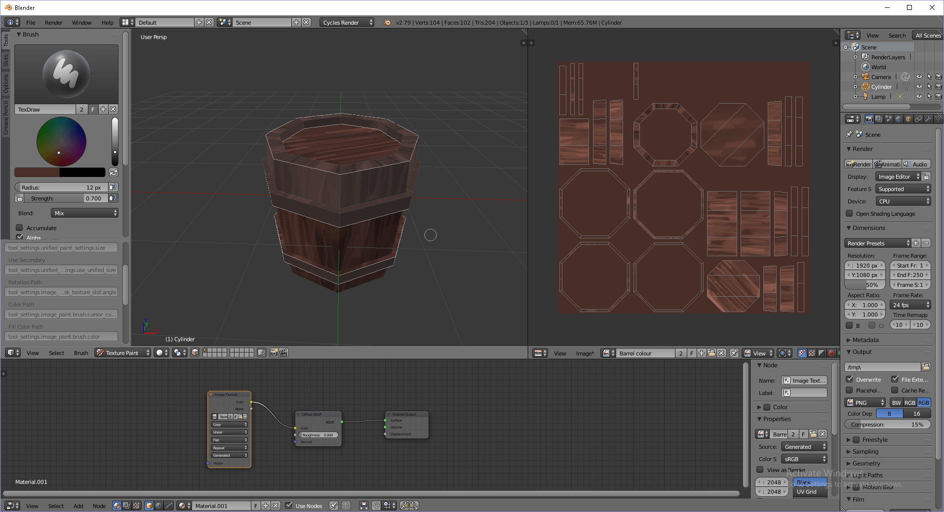
I feel as though my main issue was that I made a rough version of a lot of things instead of maybe just focusing on two final outcomes and developing them to the best of my ability. I just got so sidetracked in learning different things in Blender. Therefore, my pre production for Take Two isn’t very good.

Despite this I still have elements that I can use next semester and have a good base for me to develop from.

Basic Sheets

These could have a lot more work done to them but it’s nice and simple to show what these are going to be in ‘Take Two’.

I can make more of these for the rest of the things I plan on developing next semester for the final project.

Final Character sheet for side character Phileep:

(Sorry if it’s too small and not opening onto a separate tab for a bigger image, Click here to view it bigger scale on ArtStation)

Again, this sheet can be improved but it still helped me get my head around the secondary character. It’s also an easy way to show other people a rough outline of him. I feel as though I should go into much more detail but it’s just such a simple design that I felt like it not having much to it suits the character that Phileep is.

Final Concept for the first tool asset in Take Two:

(bigger scale) 

The Barrel Experiment

A common object in games are barrels and since it’s a fairly easy model to make, I decided to explore different types of materials and styles on it.

Here is a speed run through how it was all done:

https://vimeo.com/306070157 

(Probably the most dull video I have ever made)

Unfortunately, as I knew I was screen capturing I just kept making a lot of mistakes and rushed the painting so it isn’t my best final outcome in the video. Yet I did go over the toning after to create the final piece.

You can see I forgot to sample my colours for me to easily go back to them so some colours are a bit off. (I remember towards the end how to colour pick. oops)

(A tutorial helped me understand how to model the barrel, smart UV it, and paint the barrel).

But the process was pretty simple and enjoyable. Using smart UV project is a lot easier however I am aware that it’s not the best way to go about it.

I used 3 different brushes, a standard, a multiply and a lighten for an easier way of adding shading

I practiced using different outlines and colours on the barrel to get more confident with hand painting. This is my rough finished edit:

It needed a bit more rending and improved lighting but this was still only part of an experiment.

As much as I really enjoyed hand painting it would take a very long time for me to work into the tones and blending, it shows that it needs a lot more work.

After all of this, I decided that it wouldn’t keep my work consistent. Despite this being a cartoony style, it’s not as flat as i’m going for in my other pieces such as the robot.

Therefore, I took this opportunity to try the toon shader in blender as I’ve grown more of an understanding on how to work different materials.

Toon shading

I remade the barrel to have a fresh piece. (Also finally some work without support from a tutorial, finally getting there)

I started just adding my two basic base colours.

Here i’m just showing how I changed the colour of the world for a lighter and more bright and toony look. I just messed around with lighting using different types other than just point such as sun. However, I preferred point on the barrel.

I added the toon material to the barrel and just a base circle.  Overall, I still need to work on the light so it’s not just a point on the base.

UV unwrapping is still a mystery to me so I continued just playing about with the piece.

The good things are that this is more the style I was going for and I think it suits the concept drawings. For a start i’m pretty happy with this all that’s left to do with it in future is to explore more with the lighting and possibly make the colours a bit more bright since it looks a bit gloomy.

The final Render:

I’ve brightened it up and used hemi light on the front and a sun behind, (I do need to fix the overlapping). It still looks a bit dull but I like the style to it and it fits Take Two.

I’m happy with the skills I’ve learnt from this experiment. Yet for this to be useful for Take Two,  I’ve got the style down all that’s left is making it look more sci-fi. So I could make there be stars in the sky. However, in this game the player gets to build a second earth therefore the player has the option to design the new planet very similar to earth.

Fail:

I’m determined to fully understand how to UV wrap and unwrap but till then i’m stuck with the silver barrel of death.

So it’s beaten me however I didn’t give up there. I will learn before the end of second semester how to do it properly. Until then, I’ll just show what it would look like if it was to be properly done:

https://skfb.ly/6EqEM


Plan of Action

Main focus points:

Creating design sheets.
2 or 3 3D models in blender and substance painter.
Intro video to game.
An Art Station page.

Things to research and find inspirations:
– Sketchfab
– Similar games